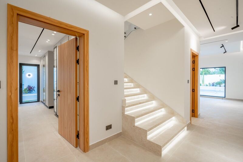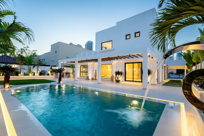
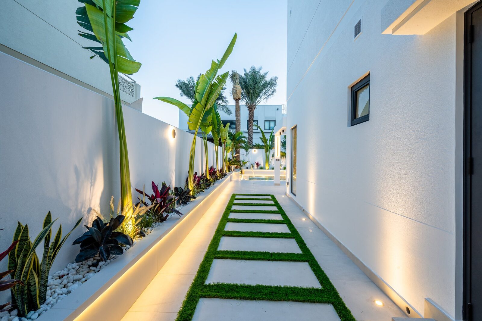
Walk through almost any developer-handover villa in Dubai and you'll see the same story on the walls: magnolia, "sand," "almond," or some other variation of beige, applied uniformly from the entrance hall to the master bedroom. It's not that homeowners love beige — it's that beige was never really chosen. It's what's left over after every riskier option has been ruled out.
That's starting to change. As more owners renovate rather than simply repaint before reselling, we're seeing a genuine shift toward considered colour — not loud, trend-chasing colour, but palettes built on real colour theory and matched to how Dubai's light actually behaves indoors. This guide explains why beige became the default, and how to move past it with confidence rather than guesswork.
Why beige became the default in the first place
Beige and magnolia dominate developer-grade villas for three practical reasons, not aesthetic ones.
First, resale — a neutral wall offends no one and photographs cleanly for listings. Second, maintenance — light neutrals are cheap and fast to touch up, and scuffs are far less noticeable than on a saturated colour. Third, and specific to Dubai: beige genuinely hides the fine desert dust that settles indoors here, and softens the glare bouncing in off sand-coloured paving rather than amplifying it the way a stark white or cool grey can.
None of that makes beige wrong. It makes it a default optimised for a landlord's risk tolerance, not necessarily for how you actually want to live in the house.
The 60-30-10 rule, applied to a Dubai villa
The single most useful piece of colour theory for a renovation is the 60-30-10 rule: 60% of a room in a dominant colour (usually walls and large surfaces), 30% in a secondary colour (joinery, upholstery, rugs), and 10% in an accent (cushions, art, small fixtures). Most beige rooms fail not because beige is a bad dominant colour, but because the secondary and accent layers are also beige, or close enough to it that the room reads as flat rather than restful.
The fix is often simpler than repainting everything. Keep a warm neutral as your 60%, then be deliberate about the 30% — a mid-toned wood cabinet, a clay-coloured sofa, a patterned rug — and let the 10% carry genuine saturation. This is the fastest, lowest-risk way to move a room away from "generic beige" without touching walls that are expensive or disruptive to repaint, particularly in open-plan living areas.
Why the swatch never matches the wall
The complaint we hear most often from clients who've picked colours themselves is: "it looked completely different on the wall than on the sample." That isn't bad luck — it's physics. Dubai's natural light has a very high colour temperature and is unusually intense, especially where it reflects off pale paving or sand before entering a room. A swatch viewed under shop lighting tells you almost nothing about how that pigment reads at 8am facing east versus 7pm under warm artificial light.
Undertone matters as much as the colour itself — a "warm white" with a yellow base can turn sickly under Dubai's midday light, while a cooler grey-based white can feel flat and clinical in the same room. Colour and lighting decisions really can't be made separately, which we cover in more depth in our piece on statement lighting design for luxury homes.
💡 Test on the actual wall, at the actual time of day
Always paint a large sample swatch — at least A2 size, not the tiny tester pot square — directly on the wall you're planning to colour, and look at it in the morning, at midday, and in the evening under your real lighting before you commit. Colour temperature shifts dramatically across a single Dubai day, and a shade that looks perfect at 9am can look completely different by 4pm.
Tonal layering: depth without contrast
One of the most effective techniques we use is tonal layering — building a room from two or three shades within the same hue family rather than jumping to a contrasting colour. Instead of beige walls against a white ceiling and grey floor, a tonal scheme might use a warm greige wall, a slightly deeper stone-toned skirting and door frame, and flooring in a complementary warm tone. The result reads as considered and calm rather than flat, without introducing any of the resale risk that comes with a genuinely bold colour choice. This warm-neutral, tonal approach is closely related to the philosophy behind Japandi and minimalist design in Dubai villas, which relies on the same layering of warm, closely related tones rather than stark contrast to create depth.
Where bold colour pays off — and where it doesn't
The real question most owners want answered isn't "is bold colour acceptable" — it's "where can I use it without hurting resale value." The honest answer is that risk is almost entirely about room type and reversibility, not about colour itself.
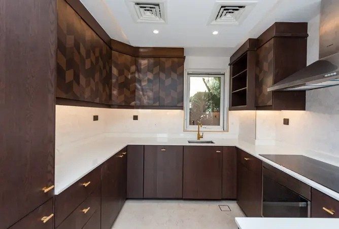
Low-risk spaces for genuine saturation include powder rooms, joinery and cabinetry colour (particularly in a kitchen renovation, where a deep-coloured island can anchor a room without dominating it), a home study, and a single headboard wall. These are contained surfaces — if a future buyer dislikes the colour, repainting one wall or refinishing one cabinet run is a minor cost, not a full repaint. Higher-risk spaces are large open-plan living areas and main hallways, which set the first impression in a listing photo — we generally recommend keeping these closer to a warm neutral. The same logic applies in a bathroom renovation: a family bathroom benefits from a calmer palette, while a guest powder room is exactly where a bold colour choice earns its keep.

Palette directions for 2026
The colours we're specifying most often on current projects share a common thread: warm, earthy, rooted in materials rather than trends. Terracotta and clay bring genuine warmth against natural stone or timber. Deep olive and sage greens work well in Dubai's light because they lean warm rather than cool. Ink navy is the most dramatic, best contained to joinery or a single wall. Burnt umber is a sophisticated alternative to black for trim. And warm greige — grey with a genuine brown or yellow undertone rather than a cool blue one — is emerging as the practical heir to beige, with far more depth than flat magnolia. See our full roundup of 2026 interior design trends for Dubai villas for the broader picture.
Colour reads differently depending on what it sits against
A colour is never just a colour — it interacts with material, finish and light source. The same terracotta paint looks rich against natural stone and timber, but almost garish against high-gloss lacquer and chrome, because reflective, cool surfaces fight the warmth of the pigment instead of supporting it. Before committing to a bold or unusual colour, look honestly at the flooring, worktops and hardware it will sit next to — matte, natural materials generally support saturated colour far better than glossy, cool-toned ones.
Not Sure Which Palette Suits Your Villa?
Our cost calculator factors in your finish and material choices alongside size and room count, so you can see how a bolder palette or premium tonal scheme affects your budget before you commit.
Try the Cost CalculatorFrequently asked questions
Why is beige still so common in Dubai villas?
Developers default to beige and magnolia because they are the safest possible choice for resale — they offend no one, they photograph well in listings, and they are cheap and fast to touch up between tenants. Beige also hides the fine dust that settles indoors in Dubai's climate and softens the glare bounced in from the desert light, which is a practical reason it became the default rather than a purely aesthetic one.
What colours work well with Dubai's natural light?
Warm, earthy tones such as terracotta, clay, burnt umber and warm greige tend to sit comfortably under Dubai's strong, high colour-temperature daylight, because the light itself already leans warm and reflects off sand-toned surfaces outside. Cooler tones like ink navy or deep sage still work well, but read best in rooms with controlled light or paired with warm materials like timber and brass to stop them feeling cold.
Is it risky to use bold colour in a renovation meant to resell well?
It depends entirely on where you use it. Bold colour in a powder room, a study, joinery, or a single headboard wall adds character with almost no resale risk, because it is contained and easy to repaint. Large open-plan living areas are where we recommend staying closer to warm neutrals, since that is the space that most influences a buyer's first impression and the cost of repainting it is highest if the next owner dislikes the choice.